
Making insurance forms feel shorter
A warmer tone and clearer questions for long comparison forms
Year
2018
Company
LeLynx
Type
UX/UI design

About
LeLynx is a website that helps users find an insurance with the best price and coverage. Users can compare car, bike, home and health insurances, and energy providers as well. I helped redesign the comparison forms with the product and tech teams to ease their completion while avoiding users loss.
Problem
In order to get quotes, users have to fill in a rather long and complex form, with questions asked by the insurers that are not necessarily understood. The forms have a very cold and administrative tone and are not transparent enough about the questions asked. There are also several questions on one page, which increases the risk of error in the answers and a feeling of length.
Goal
Make all forms (mobile and desktop) smoother and easier to fill out to drive as many users as possible the quotes pages. Use a warmer, more reassuring tone and explain to users why certain questions are important to get an accurate quote.
Process
We formed a team with a product manager, a project manager and a front-end developer to work first on the home insurance form, which carries less business risk. We used quantitative data from the form and user feedbacks on the chat to identify the pain points.
We then worked on wireframes and user flow by iterating with the product manager. This redesign was the first step to create the design system and obtain consistency in the product.
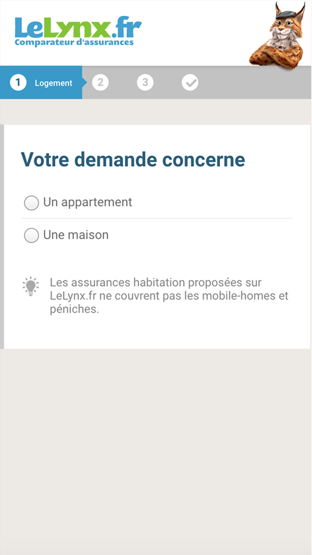
Before redesign
• No explanations on why some informations are needed
• Lack of affordance on the answers
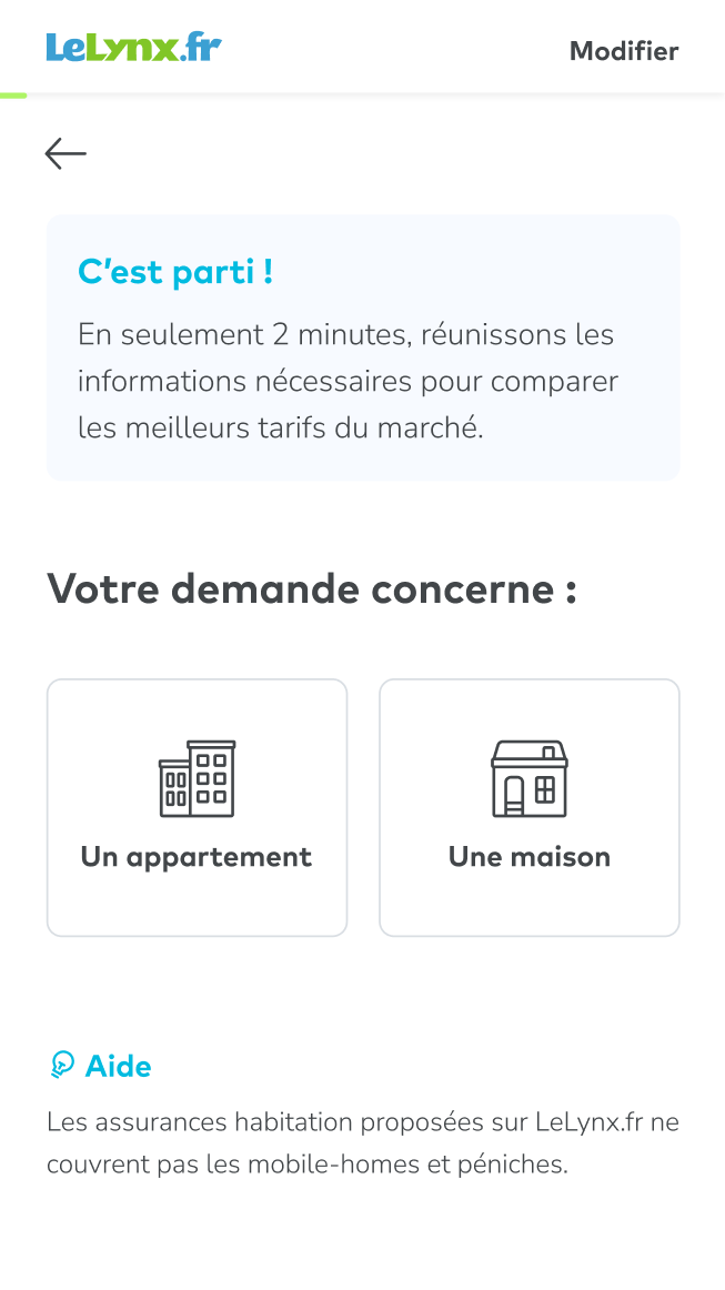
After redesign
• More transparency and explanations added
• Icons to help user scan quickly the page and find the right answer
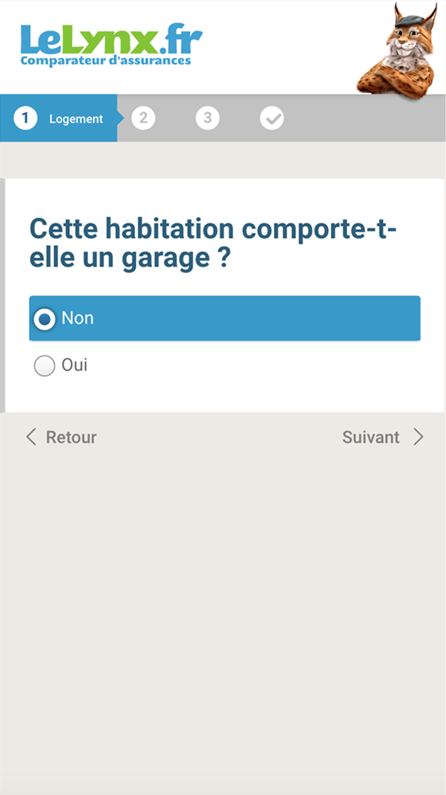
Before redesign
• Same color used for steps and action buttons
• One binary question per equipment instead of multiple choice
• Steps not optimized for mobile
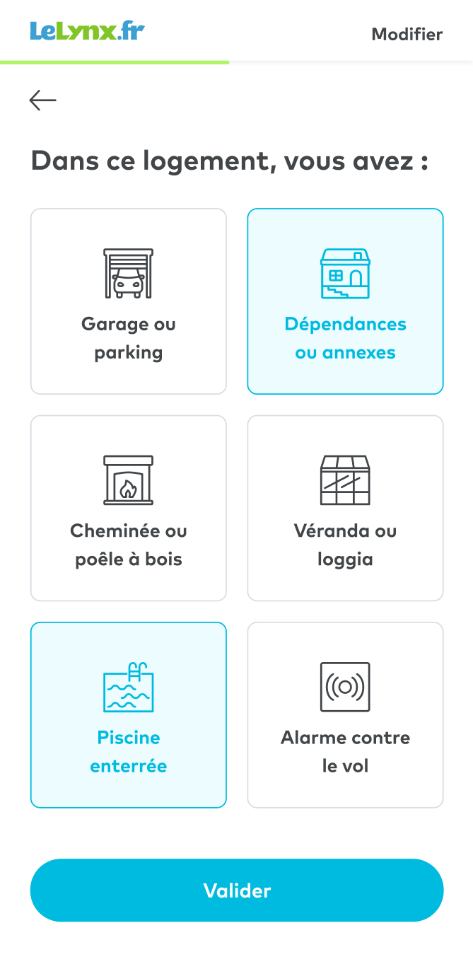
After redesign
• Different colors to separate each component
• Questions grouped by thematic
• Progress bar to help users know where they are in the form
Outcome
The home insurance form shipped first, with simpler steps and clearer explanations. The funnel was then extended to the other insurance products and became the basis of our first shared components. Analytics were limited at the time, so impact on conversion wasn’t formally measured.
Video of the form redesigned