
Fifty Onboarding
Type
UI, UX, responsive
Year
2020
Company
Fifty
About
Fifty is a B2B platform that helps users improve their skills at work by carrying out concrete actions. Their motto: "Stop talking. Start doing!". It uses behavior sciences to make users cross the intention-action gap and practice each week. Our users are employees of big companies whom HR enrolls them in a course on management, communication, leadership...
Problem
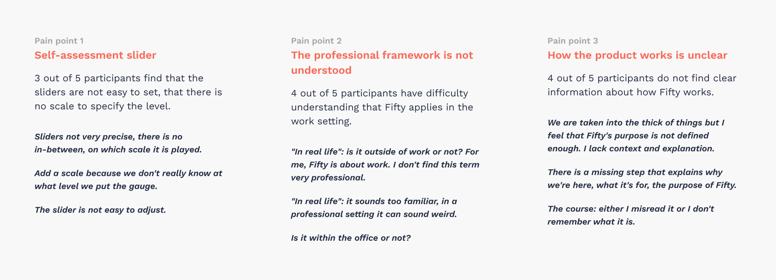
The current onboarding is not so clear for employees to understand what is Fifty and what are the benefits to them. Some steps contain too much content and mix informations with actions. I conducted user tests with people similar to our target (employee or manager in a big company) on the current onboarding to detect what were the main pain points.
Goal
Improve understanding of what Fifty is, the function of the platform. Improve the fluidity and sequencing of the registration steps and make people understand the goal of their course.
Process
I worked directly with the co-founders (CEO and CTO) on this redesign. The starting point was the fact that our speech has evolved and Fifty's mission wasn't clear enough in the current steps.
Before starting wireframes, I decided to prepare and conduct 5 users tests on the current onboarding to discover the main pain points that we have to solve in the redesign.
I also did benchmark on other SaaS platforms and mobile applications to see how the different steps are organised.
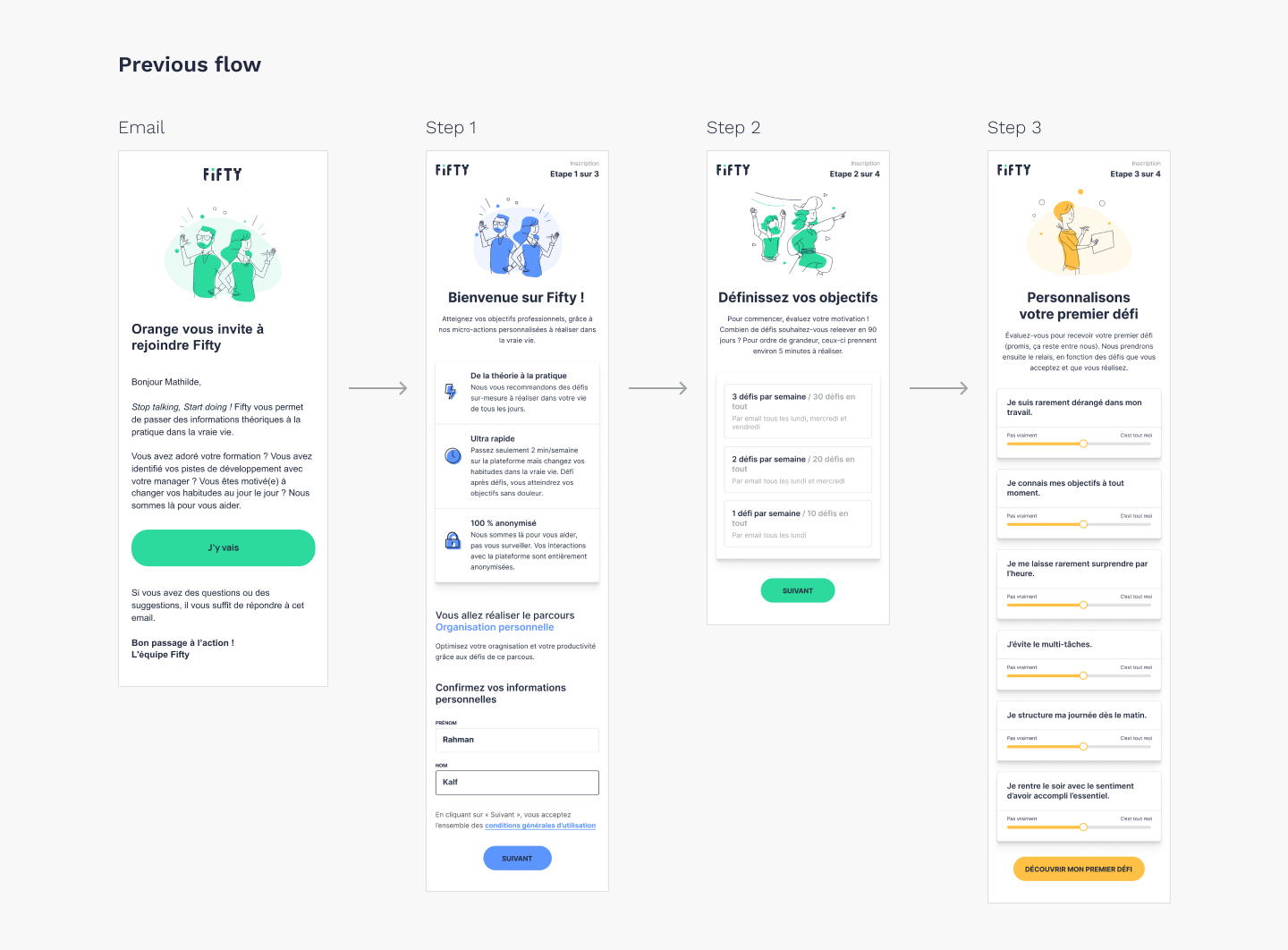
The previous flow has only 3 steps but the first one contains too many informations to be clearly understood. The user's course is lost in between explanations on Fifty and the sign up inputs. With all this text, the user is discouraged to go further.
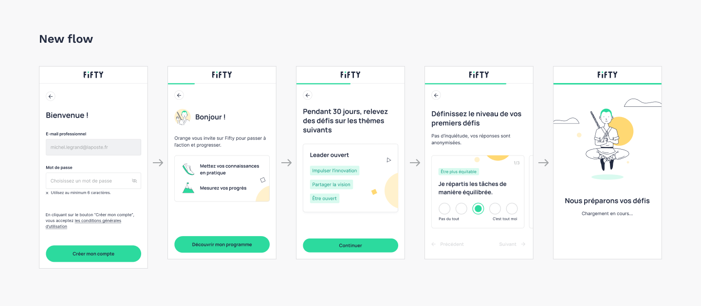
We iterate on wireframes and decided to cut the new onboarding flow in 5 steps to avoid cognitive load for users. Each step has to be simple and focus on:
- Sign up
- Why user is here and the benefits to follow the course
- What's in the course
- Challenges customisation
- Loading (labor illusion)
We added back buttons so the user can go to the previous steps (which wasn't the case in the old flow) to avoid a reactance effect.
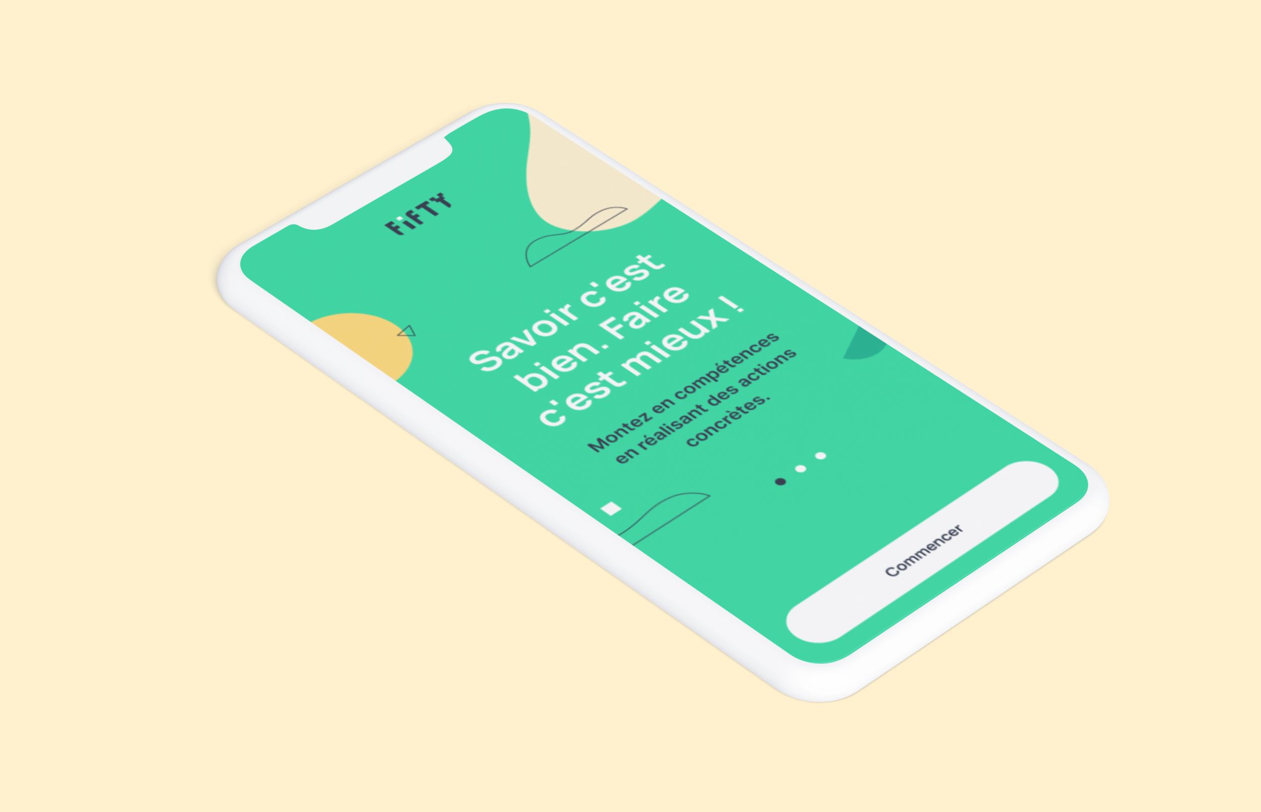
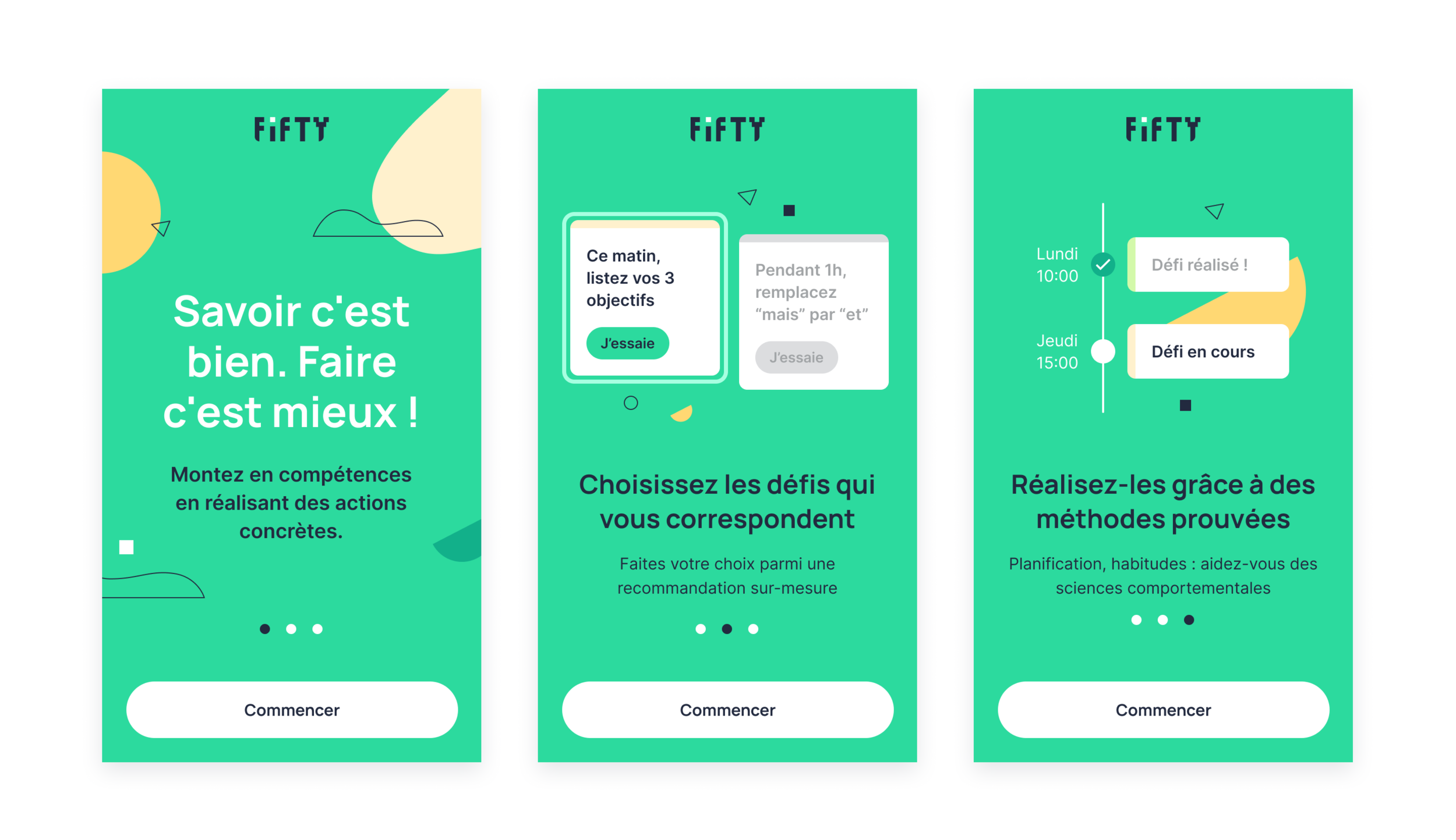
We also added onboarding slides on mobile and desktop to help understand what is Fifty and how it works before signing up.
Outcome
The new flow is clearer and easier than old one: we have less feedbacks on the lack of understanding about Fifty and users' course. We have stable results between the old onboarding and the new one despite the fact there are more steps than before. But we have to do new users tests to check if there are new iterations to do.