
When a redesign lowers satisfaction
Listening, fixing and measuring after the new Shifts page went live
Type
Product design
Company
Hublo
Year
2025-2026
About
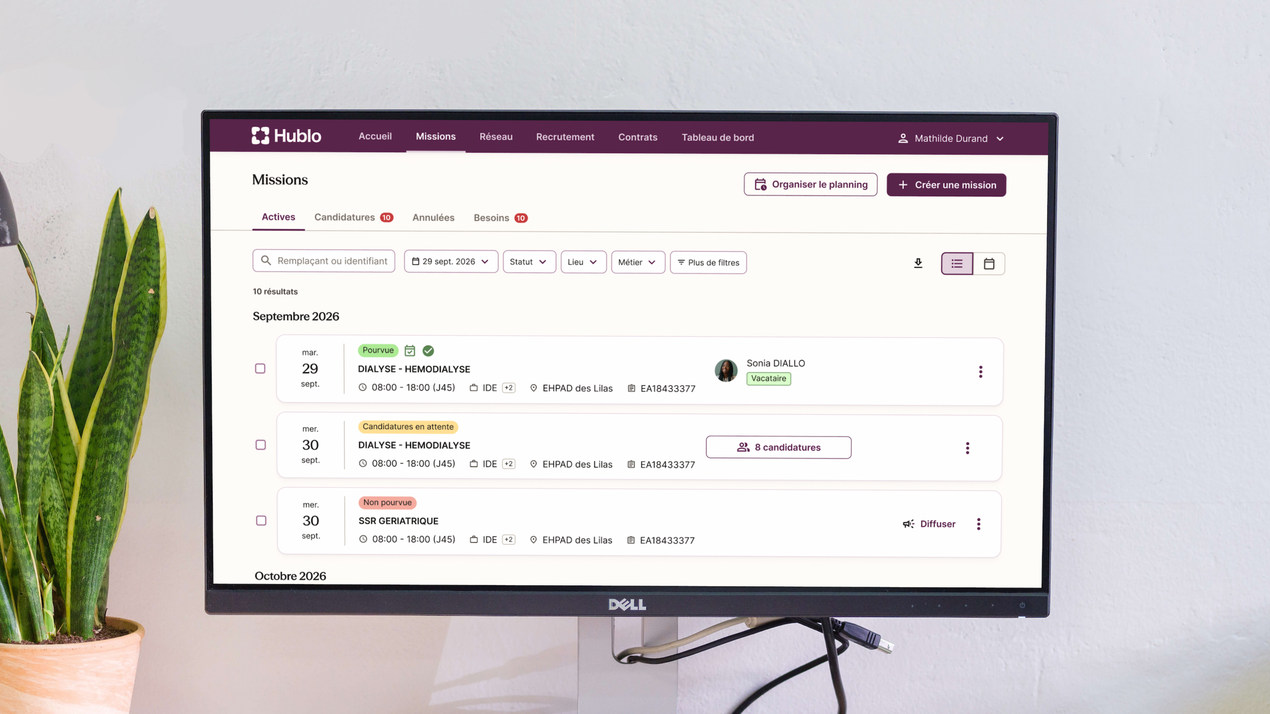
Hublo helps healthcare facilities find replacements for their staff: 600,000+ shifts are created every month. The Shifts page is where nurse managers create, broadcast and select substitutes, often under time pressure, sometimes 25 to 40 shifts a day.
The Shifts interface had barely changed in years. In December 2025, the team shipped a full redesign. I'm the only designer on the squad, working with a product manager, a QA, an engineering manager and six developers. This case study covers what came after the launch: listening to users, fixing what hurt, and measuring honestly.
Problem
Changing a tool people use every day is risky and we shipped just before the holidays, with little onboarding. We had warned that satisfaction would drop, and it did: the admin NPS fell from the mid-50s to 38 in December, then kept sliding to 30 by March.
The comments mixed two things: habits disrupted by a new interface, and real problems (hidden filters, bugs, slow candidate selection). Treating both the same way would have been a mistake. Rolling everything back or ignoring the dip would have been too.
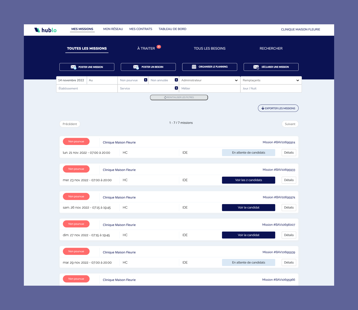
List page before and after the redesign
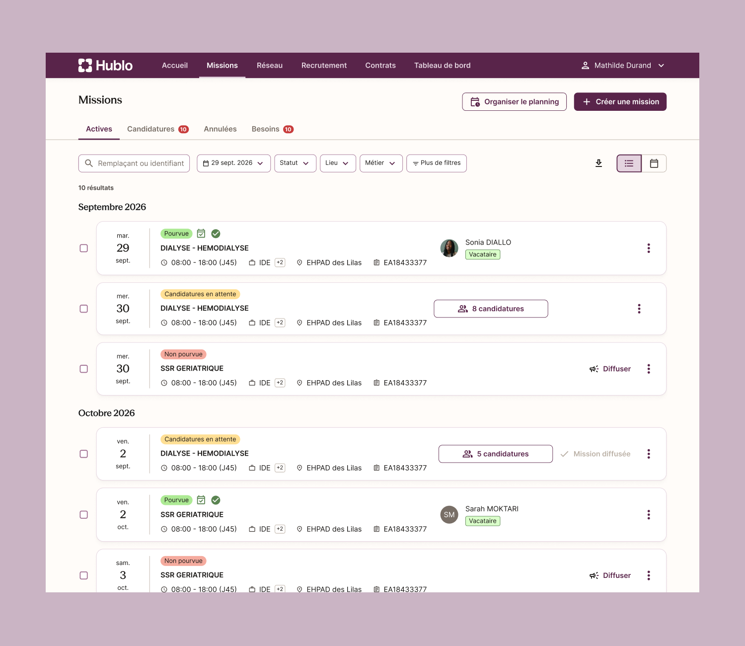
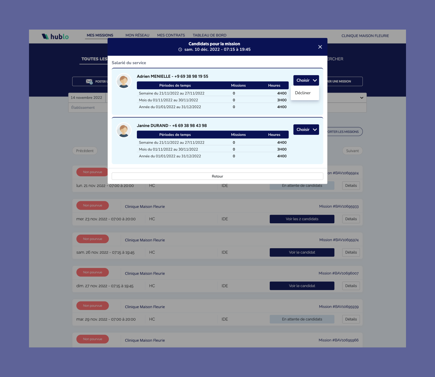
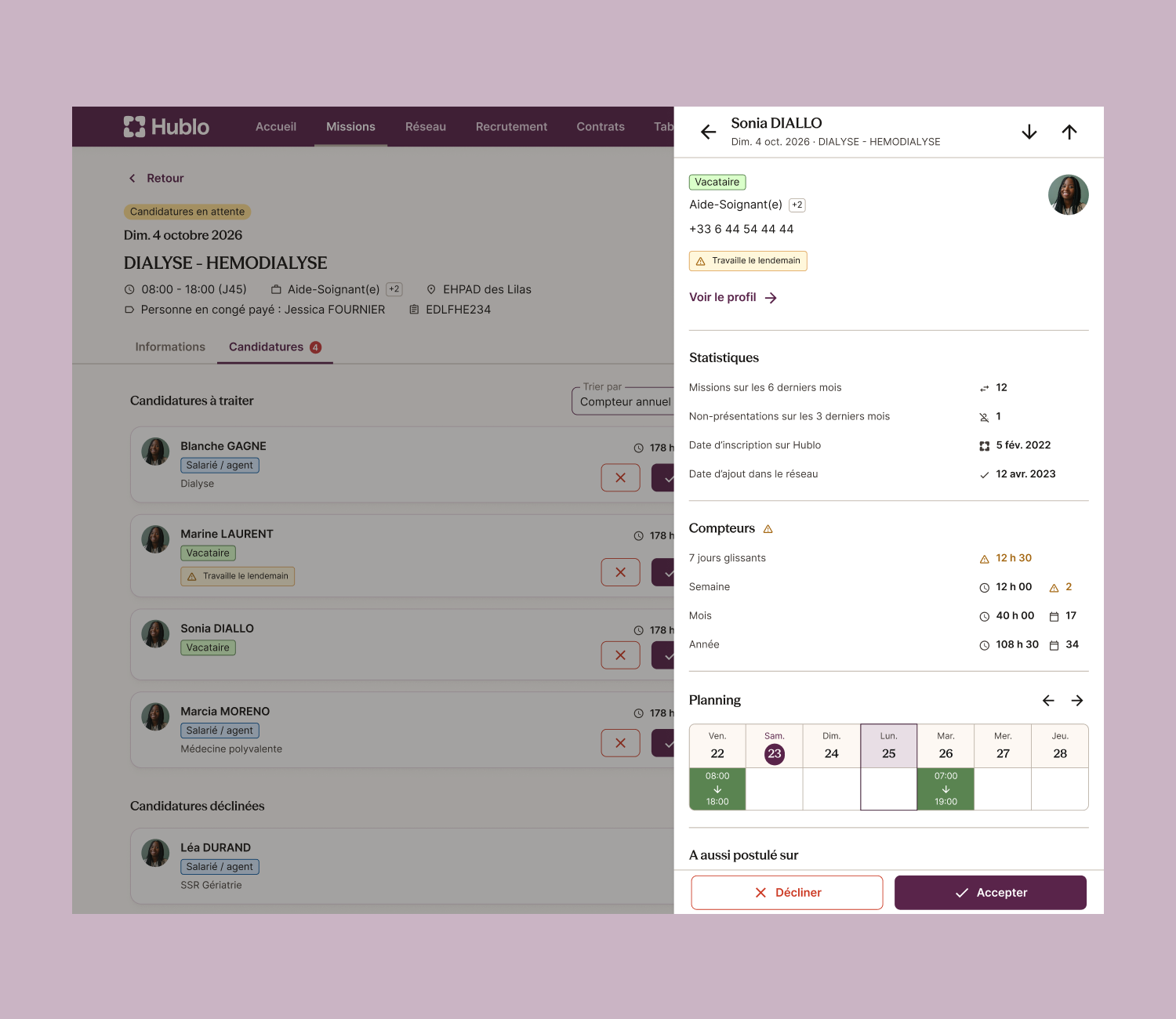
Applicant selection before and after the redesign
Goal
Understand what was behind the NPS drop and separate resistance to change from real friction. Fix the real friction quickly, without breaking the experience again. Keep the main KPI, the share of shifts realized, above its target. And monitor NPS in a way we could trust.
Process
Listening. I ran 12 interviews with nurse managers, recruited from NPS comments and support tickets. The first finding was reassuring: all 12 said they would keep using Hublo ("We'll always use Hublo!"). The frustrations were about lost habits or known concrete frictions:
Hidden filters (10 of 12): service, day/night, replacement name
No way to see who applied before opening each shift (6 of 12)
Readability and lost color cues (7 of 12)
No way to create several identical shifts at once (5 of 12)
An export too dense to use (3 of 12)
“When it works well, why change how it looks?”
Fixing. Each main insight became a ticket in a single UX/UI epic. 57 of the 100 tickets in it have shipped so far.
A few examples, from insight to fix:
Filters are hidden and tiring → new filter components to present more options in the top of the list
Choosing a candidate takes too long → a larger preview drawer to fill several shifts in a row
Too many back and forth between the list and the detail page → a preview drawer with all actions to stay in the list
The export is too dense → choose export dates and include cancelled shifts
Sharing. With the PM, I wrote a situation note that sorted every piece of feedback into three groups: handled, in progress, and not now with a reason. For example, the search bar was not a regression, so we waited for tracking data before changing it. This kept the team and stakeholders aligned on why we weren't reverting.
Measuring. I followed NPS month by month, next to the time to create a shift and the share of shifts realized, because no single number told the whole story. Each month we analysed the passive and negative NPS comments and sorted them: what was fixed, what was in progress, what could wait. For the debates that opinions couldn’t settle, like the search bar or extending the drawer to the list view, we waited for usage data before deciding.
Outcome
After the redesign went live, the average time to create a shift dropped from about 4.0 to 3.1 minutes (about −23%), and the median from 1 min 47 s to about 1 min 40 s.
The share of shifts realized is at our target.
Admin bugs created fell from 70 in December to 45 in January and 20 in February.
Negative feedbacks on the shifts section has decreased and topics are more focused on features or new opportunities
NPS has not gone back to its pre-launch level, but the trend is encouraging. It also measures far more than the Shifts page (support response time, login and permission bugs, the pace of change), so I can't credit or blame the redesign alone.
The biggest lesson: following SaaS standards isn't always right for the context and the business need. Healthcare managers move fast and are often in urgency, and going back and forth between the list and a detail page cost them too much time. The old version had a modal for exactly that reason, and adding a drawer to the new one confirmed how strong the need to stay in context is.